This is a curve that was commissioned from me by a friend. It’s rather strong, so I suggest turning down the opacity on it, but…
here’s a link to download your free Wes Anderson inspired photoshop curve.
This is a curve that was commissioned from me by a friend. It’s rather strong, so I suggest turning down the opacity on it, but…
here’s a link to download your free Wes Anderson inspired photoshop curve.

Today’s post is about using Photoshop to fix small problems in photos.
For example, you take a picture of your friend and they aren’t exactly smiling.
This can be fixed in Photoshop.

This is the photo I started with.
First I’ll fix the contrast a bit.

Now here’s how we’re going to adjust facial features: the Liquify tool.
It can be found in Filter tab.

This is a tool many professionals use to make models look thinner, enlarge their eyes, and even completely re-proportion facial and body features.
That being said, it’s also extremely fickle and can have disastrous results if you try too hard and don’t pay attention to details.

The screen should look something like this when opened.
I don’t personally like drastically altering what people look like in Photoshop.
So, I’m going to use it to make the blonde little girl smile a bit more using the brush.
The key to this tool is subtlety.
Moving anything too much will make it look unnatural and distort the photo.

Now I’m going to put Julia Trotti’s “Humming Bees” curve to give the photo a bit of a vintage look.

It softens up the photo and adds a bit of warmth.
Now to add even more I’m going to paint some digital light leaks on another layer over the photo.
I used a yellow shade and then played with the layer’s opacity.
(For another way to do this you can check out this post by Cameron Rad.)

The key to making most digital light leaks look realistic is to make sure the brush being used has a very soft edge.
Now I’m going to add a bit of a vignette to the photo, just so the edges of the picture are a little crisper.
To make a vignette, you can select the Gradient Tool (hidden under the Paint Bucket in the Toolbar).

Make sure that the color and transparent option (second to left on the top row in the picture above) is selected, as well as the circular gradient shape next to these options.
(If that doesn’t make sense just copy what I’ve done in the picture.)
Just click, drag, and let go and your gradient should appear.
I always do this on a separate layer so that I can play with the opacity.
In this picture I turned it way down because I only wanted a very subtle darkness on the edges.

That’s all folks.
Here’s Conor Oberst‘s Milk Thistle for nostalgia’s sake.

Today will be about making the eyes pop, while not over-powering the photo.
I’m starting with an old, pre-edited photo of my cousin’s child.

This was another one from before I had Photoshop and when I had a bad monitor.
It didn’t turn out quite how I’d wanted it to so I’m going to fix it up.
To start making the eyes less dull, I’m going to use the Dodge Tool.
It’s in the Toolbar and looks like a black magnifying glass.

The Dodge tool lightens parts of photos, and alternatively the Burn tool darkens.
Here it’s made the shine more white, and the eyes brighter.
In film photography it was much trickier since the photographer/developer would have to find a way to expose only the part they wanted to brighten for longer.
On top of having to manipulate the light for exposure it would sometimes become a guessing game of how long to expose it to brighten it because if it was too long, it would look odd since the rest of the photograph would be much darker.
Now that today’s photo-history lesson is over…
When I had originally edited this, I didn’t have a way to remove the pasta stain from her skin.
Now I’m going to get rid of it using the Patch Tool.

I’m also going to increase the contrast now.
The old version looks dull because my monitor made it look like the contrast was fine.

The skin under her lip still looks a little patchy from the pasta.
To fix this, I’m going to use the Surface Blur technique I used in a post 2 weeks ago.
Children tend to naturally have nice skin, so this is purely to even out the skin tone.

Now I’m going to go ahead and put a Curve on this.
I used Julia Trotti’s “Lullabye” for this one.
It gives it whimsical purple and pink tones that also match her dress.

Now like in my Selective Coloring post, I’m going to use the Hue/Saturation Adjustment to change her eye color slightly.
I’m going to use the Layer Mask that is made when creating a Hue/Saturation layer.
I have it high-lighted here so everyone can see where the Layer Mask is.
Make sure you have the Mask selected to add or subtract from it.

Now the Paintbrush can be used to add or subtract from the selection.
White adds. Black subtracts.
I’m going to select just the eyes.
This means I can change just the blue of her eyes without effecting surrounding colors by selecting Blue and Cyan from the drop down and changing them by playing with the Hue slider.

Here I mostly just lightened them and gave them a slight teal tint.
This works best for changing blue eyes since they contrast so well against skin, but can be done to other eye colors as well as long as you get a good selection.
Here’s another, more apparent example using this on my own eyes.

That’s all for this week.
Here’s a little She & Him for listening to while editing.
Have a _______ Thanksgiving.
(I don’t want to tell you what kind of Thanksgiving to have.)
I’m going to do something a little different today and go through some of the photographers that have influenced both how I take and edit photos.
The best way to learn Photoshop editing, at least for me, was to find something about a photo I liked the look of…then try to reproduce that effect in Photoshop, to varying degrees of success.
So, without further ado, here are my top 3 favorite photographers:
1. Nirrimi Joy Hakanson

Picture commissioned for Myer’s Miss Shop Lookbook.
Nirrimi is an Australian photographer and probably my favourite photographer because she always manages to make all of her photos look nostalgic. She used to be a bit of a wanderer, traveling through many countries, taking pictures mostly for fashion magazines, but since then she has had a child and settled down a bit. None of this has dampened the wanderlust that shows through in her photography, really it’s just added a touch of warmth and home to her photos. She keeps a blog where she documents her new lifestyle as a young mother, and if you wander far enough back you’ll find some of her older photography. Nirimmi is also where I learned a lot of what I know about Photoshop Curves. She maintains an online shop for her Curves here, but there are two (Cult and Great Grandma) curves up there for free right now.
2. Eric Ogden

Photograph of Sufjan Stevens.
Eric Ogden has taken pictures for many different magazines and won various awards (there’s a list on this page). He’s an American photographer, and he’s fantastic at getting dynamic portrait shots. He’s taken pictures for many celebrities including Steven Spielberg, Philip Glass, Fergie, Kevin Bacon, and Kings of Leon (though this is only a very small portion of the number of people he’s photographed). His photographs tend to feel both staged yet incredibly real at the same time, perhaps because of the sharp contrast and colors too vibrant to seem real. Actually, the best way to describe it would be like a frame out of a movie. It’s made to look realistic, yet flawless.
3. Julia Trotti

Picture for Black Milk Clothing.
Julia is mostly a fashion photographer though she also dabbles in music photography as well. She’s been featured in the Digital Photography and Design Magazine multiple times. Her portfolio can be found here. She’s also shot for many companies like Black Milk and Oh Deer Boutique. Many of you may recognize her name since I use many of the free curves she makes in editing my photos. There is a collection of her free Photoshop Curves here, as always. Her photos come off as very whimsical, yet realistic, which makes it seem like her photos live in almost a world of their own.
And that’s it for now.
Since I’m feeling nostalgic I’ll leave you with a good, old song,
“Cape Canaveral” by Conor Oberst for this week.
Let me know if you have any suggestions for next time.

Hello again,
Today will be about using Photoshop to add make-up.
It’s surprisingly easy and can take a lot less time than real make-up.

All you have to do is chose what color you want in the color picker.
Then make a new layer and do all your painting on this layer.
Next turn the opacity down on that layer so the skin’s texture comes through.

Make sure only to apply the color in places where make-up would actually be.
Then we’ll clean up any blemishes with the Patch tool.

Now to clean up the skin even more, start by duplicating the original layer.
Then go to Blur and choose Surface Blur.

You can play with the setting to get the kind of smoothness you’d like.
I left mine on the original settings since I wanted fairly smooth skin.
And this is what it’ll come out like.

Obviously this has blurred things that should not be.
For this we can just use the eraser to get rid of the blur in unwanted areas.

Then I’m making her lips a little darker using the same technique I did in the first part.
As I said before, be careful to make sure the color only gets where people would usually apply it.
(Sorry guys, girls will be predisposed to be a little better at this.)

And now I’m going to add in some more smoke.
Here’s some smoke brushes to do so.
You can go to the Window tab to activate the Brush window.
This toolbox will allow you to rotate the smoke if it’s going the wrong direction using the little compass looking thing.
Just click one of the arrows sticking out and drag, you’ll be able to see which way the brush is moving at the bottom of the window.

Even though the smoke brushes are already fairly opaque, I’d turn the opacity down a bit anyway just to be sure.
Then combining everything together for contrast and color editing will make it look more cohesive.
Then the “Alice in Wonderland” curve will also help all the colors go together as well as bring out the purple tones already throughout the photo.

And that’s all for this week.
As always, if you have any suggestions let me know.
This time I’ll leave you with an awesome song by the XX.

So here we are again.
Today will be about using coloring to bring focus to your subject.

This is what I started with.
First, I’d like to get rid of the button on her shirt.
It distracting and hard to read anyway.
I’ll start by using the lasso tool to select around the button.

Then go up to Edit and Fill from the drop down.
Under the Content options, make sure Content-Aware is selected.
Everything else should be fine, so hit okay.

Now, I really should have done this first, but now I’m going to fix the photo’s cropping.

Then fix the Brightness and Contrast.

Now I’m going to clean up her face a bit, just so it looks nice and polished.

Now to use color to focus on the subject.
First, I made a careful outline around the girl’s face.

Then hit Command+Shift+I to select the inverse.
Now the Hue/Saturation tool can be used to turn down the Saturation of any and
all colors as much as you want.
The face will stay the same color.
I decided to put it all in black and white.

Now I’m using the Gradient tool just so the right side of the photo isn’t so distracting.
The settings I used are visible at the top.

Now I’m going to add a Curve.
I used “Toes in the Ocean” by Julia Trotti on this one.

I’m going to go ahead and use two, actually.
The other one will be “Wild at Heart”.
And I think I’ll stop at that.
Now that her face had the brightest/only colors in the photo,
it draws you towards it instead of of, say, the guy in the background.

As always, If there’s anything you’d like me to discuss, let me know.
This time I’m leaving you with an amazing music video for
Edward Sharpe & the Magnetic Zeros’ song “Man on Fire”.
Happy Halloween!

Today I’m listening to a collection of old Ink Spots albums…
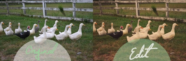
So making photos look vintage seems appropriate.
Of course, having friends that love dressing up in vintage clothing helps for this one.

First, I’m going to up the contrast a little bit since the photo got a little washed out by the sun.
I’m going to merge this adjustment layer with the original photograph layer so that it won’t interfere with changing it to a black and white photo.

Now to turn the photo black and white I’m going to use the Black & White tool in the Adjustments window.
This way to turn things black and white is nice since it lets you play with the color sliders to make colors brighter or darker.
Play with these until it looks good to you, or you can even play with the options in the drop down box.
The Infrared option in there usually brings out an interesting effect.

Now I’m merging the black and white layer with the original again.
Then I’m going to up the contrast just a bit then since I’m personally rather fond of high contrast black and white photos.

Now I’m just going to clean up the skin and such.
In older photographs they sometimes used green powder on the skin to make it shine less while still making the highlights stand out.
It makes a nice and even skin tone for black and white photography.
Since I didn’t have green powder at the time though, I’m just to fix it up in Photoshop.

And now, since black and white photos never seem to manage to stay black and white for long, I’ll put a curve layer over all of this.
I’m going to use Julia Trotti’s “Alice in Wonderland” curve again.
(Once again, the link is at the very bottom of her post.)
I think the purple hues will go nicely with this photo.
And then I think I’ll call this one done.

If you want to give it an extra vintage feel, you can always overlay a super grungy texture or even put coffee stains on it.
As always, if there’s something you’d like me to talk about let me know.
Today I’ll leave you with a little bit of Dame Vera Lynn.
(Fun fact: that song’s been covered by both the Ink Spots and Johnny Cash.)
Hello once again,
Last week someone asked how to change skin colors so that’s what this week is.

Here’s the photo I started with.

First off that pink is way to bright so I’m going to turn the saturation down on it.
Using the Hue/Saturation option in the Adjustments window will let me do this just to the pink of her dress.
To do this, I used the drop down to select the Magenta hues, then used the slider to turn the saturation down.

And this same tool will allow us to change skin colors too.
Skin generally falls into the Red hues option.
You can use the saturation and lightness sliders together to change natural tones.
If you want an unnatural tone like say, green or blue, instead you can use the Hue slider to completely change the color.
To keep this from spreading to other areas of the photo that might also be Red, it’s best to select the general area of the skin first.
It can always be cleaned up afterwards.

Here, it has gone onto her hair.
So for that, you can use a layer mask.
With the mask, black paint will take away the blue that’s been added, and white paint will put it back.

Then just use that to clean up the blue.
Make sure you have the layer mask selected instead of the actual layer.

And now we have a little Smurfette.
Now I’m just going to keep selecting little bits and pieces I want to change the color of until I think it looks right.
And I end up with a little alien girl, or maybe young Mystique.

As always, if there’s something you’d like me to talk about, let me know.
Today I’ll leave you with a really cool music video for Gotye’s song “Bronte”.
Hello again everyone.
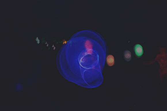
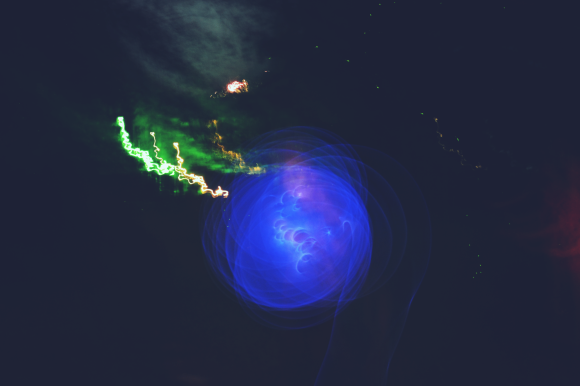
This week I’m going to be playing around a bit with overlays.

I’m going to start by choosing which two images I’d like to combine.
For best results they should be somehow related.
In the case, I’m going for sort of the fantasy of the book having jumped out of the pages so anything beautiful will sort of apply.

Now to simply overlay, copy your second image on top of your first. Then set the opacity down on the top layer (this option is in the top right of the Layers window, displayed as a percentage).
Set the opacity to whatever looks good to you.

I set the one here to about 75%, but this covers up the figure in the picture.
I want him to stand out against the “imaginary” background that is supposed to be coming out of the book.
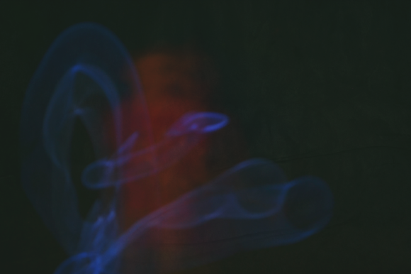
For this, I’m going to use the Lasso tool to select my figure.
(It may help to briefly make your first layer invisible while outlining the figure.)

I used the Polygonal Lasso tool because I wanted a sort of cut out feeling to it.
Now, with this area selected, go to your other layer.

Make sure you have the overlay image selected in your Layers window.
Now hit delete.
This will clear that area in the layer, and now our figure is visible. Now it’s time to play with curves again.
Since I’m going for a storybook feel here, I’m going to use “Alice in Wonderland” by Julia Trotti.
(The link for this one is at the very bottom of the post.)
This curve adds lots of purple hues that bring out sort of a fairy tale vibe.

Now I’m going to add a quote by William Nicholson.
The font I’m using is called “Delicious Cake” made by Jellyka Nerevan.

And now I’ve completed my Public Service Announcement.
Again, if there’s anything you’d specifically like me to talk about, let me know.
And this time, I’ll leave you with this awesome dance video that goes through all the fashion and some of the history from the past 100 years.